SAVING MR. BANKS
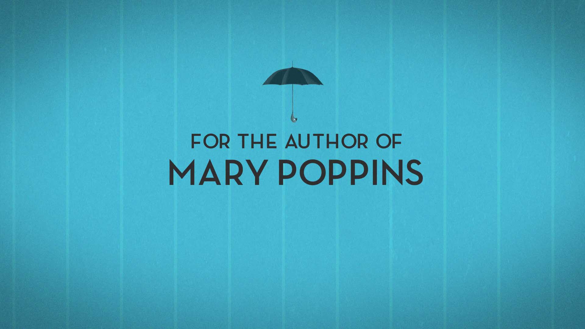
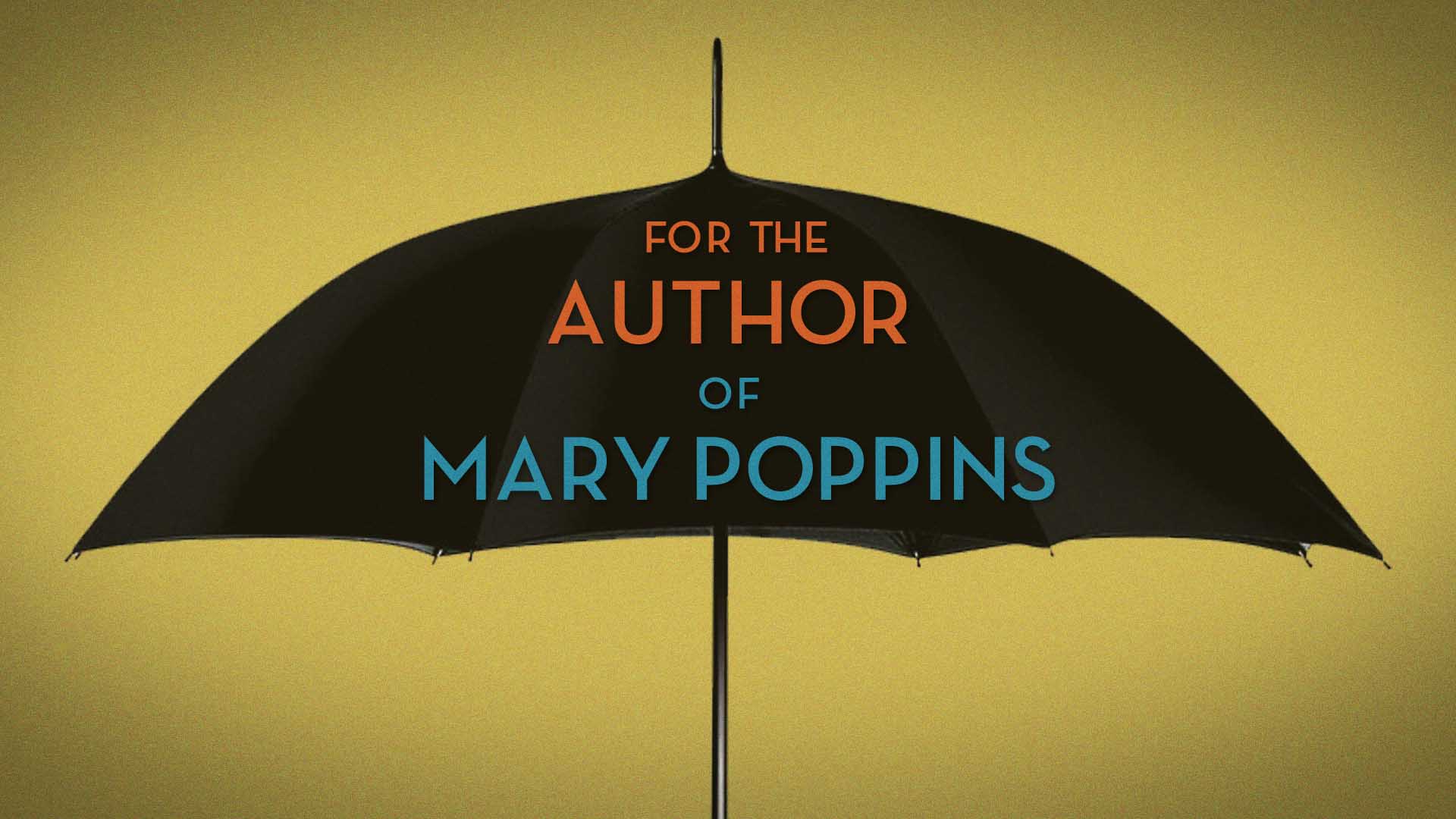
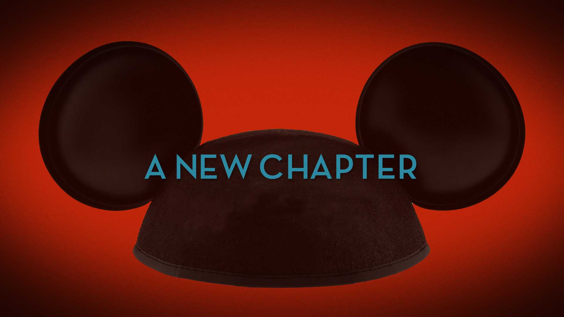
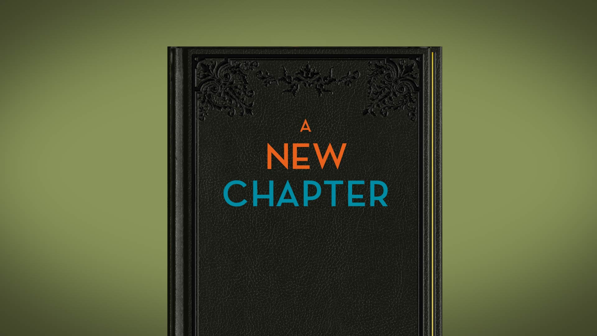
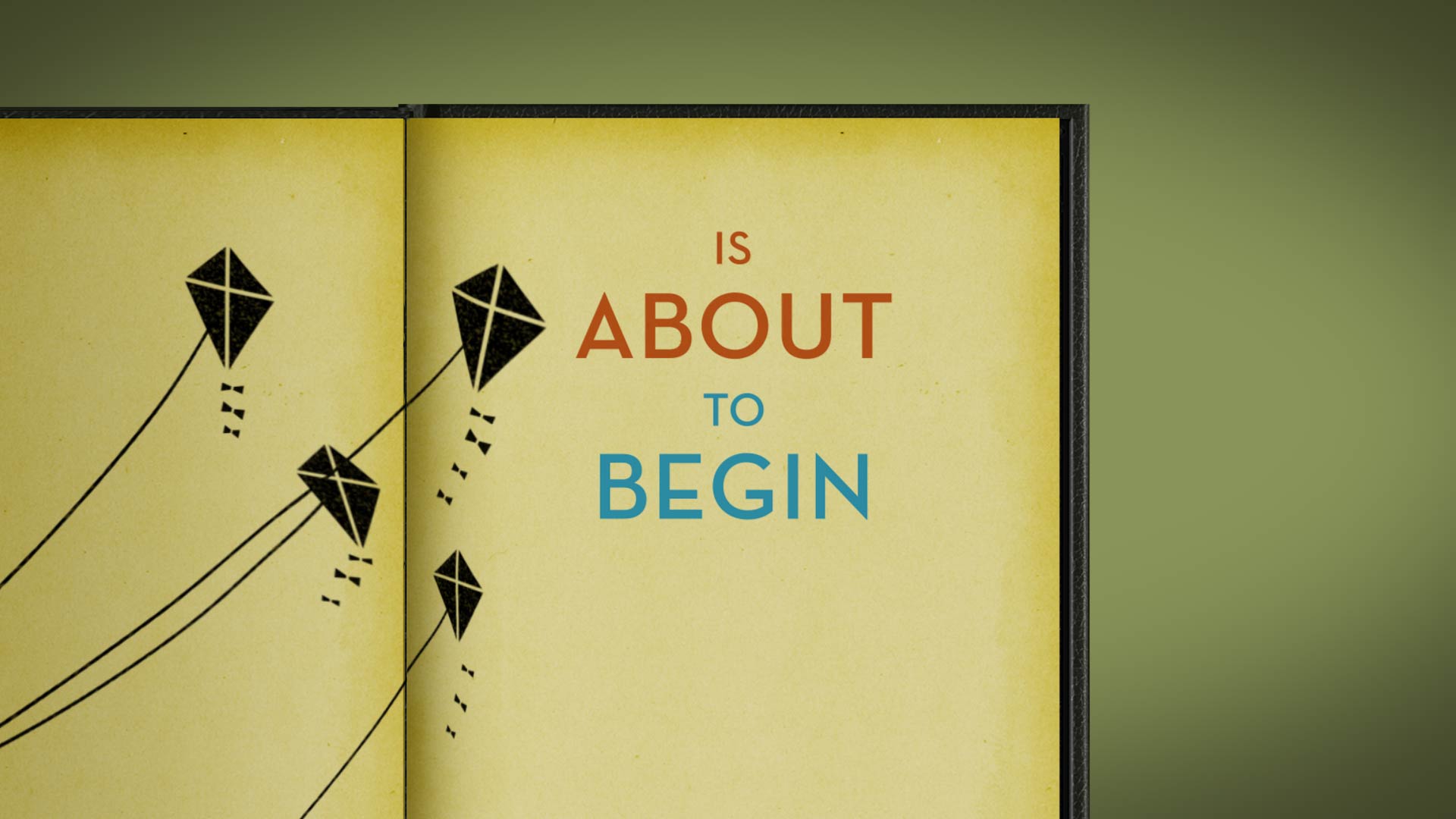
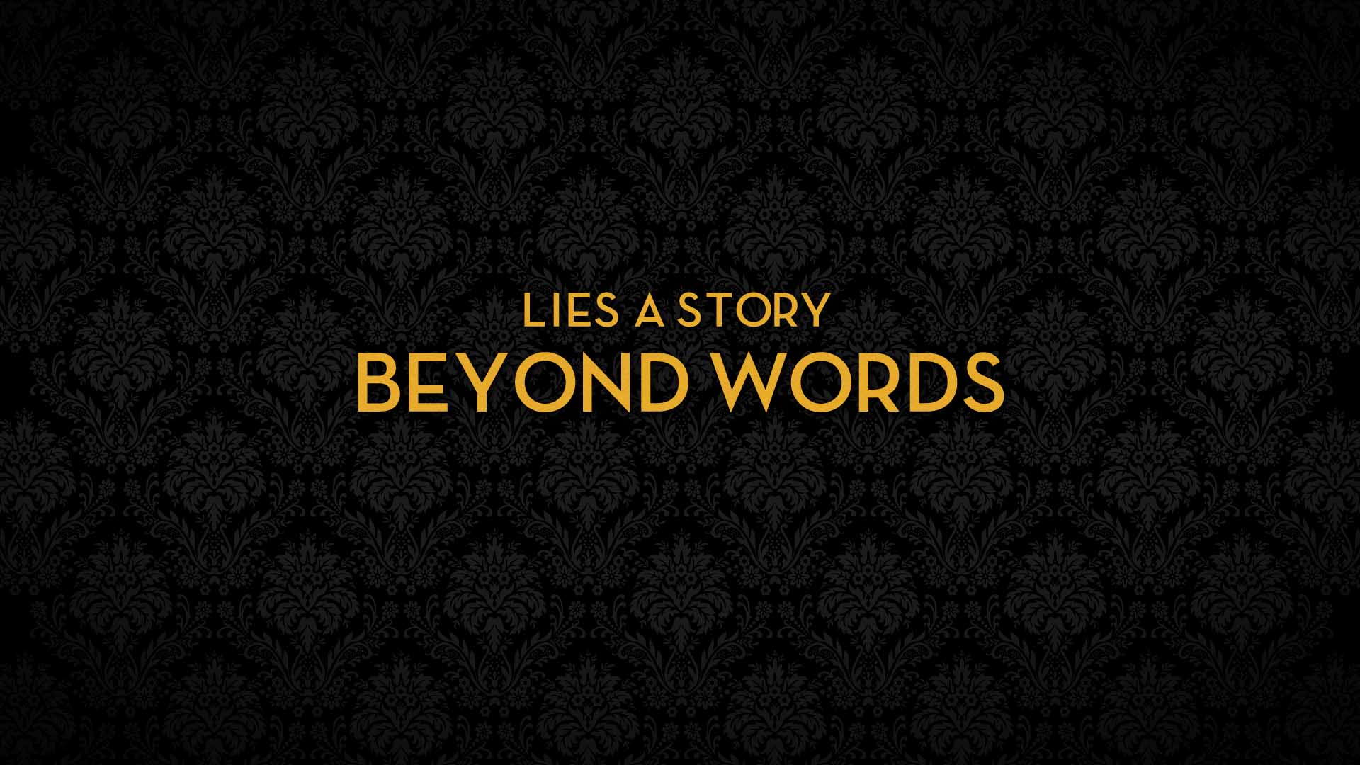
While designing graphics for Disney’s Saving Mr. Banks, we teamed up with Motive and summoned our inner Mickey Mouse. It took us back to the 1950s, where typefaces used on the Disney lot were developed by the well-revered modernist architect of the era, Richard Neutra. This exploration inspired us to use the Neutraface typeface in all our graphics while accentuating the elegant feel with a polished golden look.
We designed many different looks for this project, inspired by Mary Poppins, 50’s design, and classic Disney. Although they weren’t included in the final cut, we sure had a lot of fun creating them!


