REDNECK ISLAND SEASON 4
It’s all about The South in this popular ‘redneck’ reality competition series. We successfully branded the first three seasons of REDNECK ISLAND with our partners at CMT and as season four kicked into gear, the network decided it was time for a rebrand. Our task was to update the series graphics to match a younger, hotter and crazier direction for the show. The season four cast was comprised of a new generation of ‘redneck’ singles hoping to win a cash prize by eliminating their competitors and partying along the way.
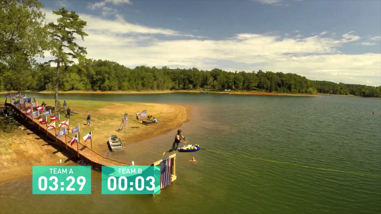
With a newly designed clean and simple logo as our starting point, we carried the theme of geometric lines into the show open, introducing graphic color bars, overlays and heavily stylized hyperrealistic footage treatment throughout. We did all the editorial for the show open, and created a comprehensive in-show graphics package that covered all game play elements and identifiers and implemented a clean, bright color palette that kept the look of the show simple and fresh.
Main Title


Show Package